
A Form field collects user data and serves as the display or user interface within the system. Form fields (sometimes referred to as 'components' or 'controls') define the way the user enters a piece of data and the format that the data is saved as.
This article covers Other Fields. There are also further articles on Common, Layout, Advanced and System Fields.
Adding a Form Field
To add a form field to a form, drag and drop the component from the left column into the desired location within the form.
Each new form starts with a submit button automatically added to it. This can be removed or edited as necessary.

Editing a Form Component
To edit a form component on a form, hover over the component and click the gear icon. You will then be presented with a settings form for the component.

The settings for a form component are different for each component type.
The email component is nearly identical to the text field component. The Email component has a format validation setting that ensures the value entered is a formatted email address. The email component can also be integrated into a form’s email action.
Text Area
The Text Area control has the same properties and functionality as a text field component, only it allows multi-line input.

Unique Properties
- Display
- Rows: This allows you to set the default number of rows for the Text Area control
- Editor: This allows you to add a WYSIWYG editor to the Text Area Control, and select what type of editor you would like. Currently the only options are None (default) and CKEditor (WYSIWYG)
- Show Word Counter: Shows the total number of words that have been typed into this field
- Show Character Counter: Shows the total number of characters that have been typed into this field
- Data
- Input Format: Choose from Plain (Recommended), HTML or Raw (Insecure)
- Validation
- Minimum Length and Maximum Length: Allows you to set limits on the number of characters that can be entered in the field
- Minimum Word Length and Maximum Word Length: Allows you to set limits on the length of individual words that can be entered in the field
- Regular Expression Pattern: Sets a pattern to validate the input against. Will stop the form from submitting if the pattern is not adhered to.
For a full list of properties see the Common Field Properties article
Slider
The Slider field is a stylised radio button which allows the user to choose a response based on a sliding scale.
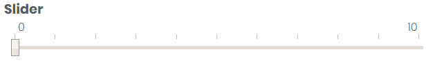
Unique Properties
- Display
- Minimum Value and Maximum Value: Allows you to set the upper and lower limits on your sliding scale
- Step: Allows you to set the increment that the slider will move at between values. For example a step of 2 on a scale from 0 to 10 will limit possible values to 0, 2, 4, 6, 8 and 10. It is recommended that you use a step that fits evenly into your range, but not required.
For a full list of properties see the Common Field Properties article
Image
The image component allows you to display an image in your form.
Unique Properties
- Display
- Image (upload): Asks you to upload the image to show on the form. If an image is already uploaded to the control, a thumbnail will appear here. You can remove the image by clicking the cross, and then upload another image if necessary.
- Image Size: Sets the size of the image relative to the width in columns property
For a full list of properties see the Common Field Properties article
Country List
A Country List is a dropdown list which is pre-loaded with a list of countries for the user to select from.

Website Link
A Website link allows you to attach a direct link to a website inside your form. The website will be opened in a new tab when the link is clicked on by the user.
For an example of how to use this field, see our article on Inserting a File Download Button.
Unique Properties
- Display
- Link Protocol: Allows you to select either, http, https or mailto as the protocol for the link.
- Link Address: address of the site you want the user to be able to access. This should not include the link protocol
For a full list of properties see the Common Field Properties article
HTML Element
A completely customisable HTML element. A basic application of this element is a replication of the Notes/Help editor, without the question mark in the title. You can also use this component to embed videos in non-pop-out form.
Unique Properties
- Display
- HTML Tag: The tag of this HTML element
- Attributes: Allows you to assign values to any HTML attributes you would like to add
- Content: The HTML content you would like to display
For a full list of properties see the Common Field Properties article
Comments
0 comments
Article is closed for comments.